Designing a PowerPoint presentation is not an easy task. While everybody can create a presentation, not everybody has the skills and experience to nail the design part.
A great-looking PowerPoint presentation will help you to impress your audience, and possibly close more deals. And if you are still not sure about the importance of the presentation design, imagine what signals are you sending with a poorly-designed presentation.
Just have a look at the difference between these two slides:

Trust me. You don’t want your audience to think: “well they didn’t really care enough” or “that was probably a last-minute preparation”.
To avoid this situation, you want to do everything that you can in order to improve the design of your PowerPoint presentation.
If you care about the result of your presentation, continue reading this list of 6 PowerPoint design tips!
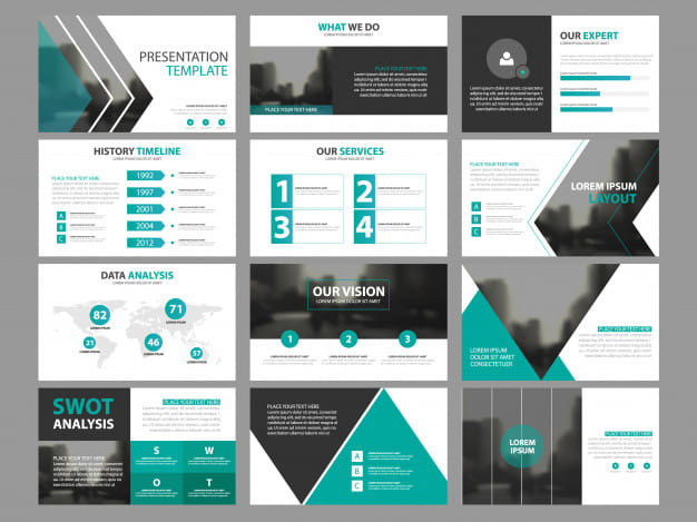
1. Avoid using stock templates
Now some people might disagree with me and I get it. You have maybe a deadline till tomorrow and a good stock template might give you some ideas on how to structure your layout pretty fast.
But are you sure you want to go that road?
You see, here are the biggest problems and downsides when it comes to using stock templates:
- They are not tailor designed for your company & your message – What does it mean? Well, when I design presentations for my clients, I always make sure they are branded and the design literally conveys the main message of the whole presentation. Something you can’t do with a template.
- Templates look good only with placeholder content – When you are looking at any presentation template, you need to be aware that your content is completely different. So what you have prepared for one slide might not fit on the slide on the template.
- They usually look all the same – While this might not be a big problem, there is just something about standing out and being creative.
- Thousands of others probably used it.
These are just a few main reasons why I think it’s a bad idea.
Small note: there are situations when I recommend using templates. Many students reach out to me that they need help with design, but they simply don’t have a budget or time to improve their presentations. In this scenario, I always recommend using a template.
2. Utilize the power of the fonts
Fonts are incredibly underrated. Depending on what type, and combination, of fonts you use will determine the overall feel and vibes of your PowerPoint presentation.
Typography is the most part of every design and specifically neglecting this one might result in poor design.
So there are 4 main types of fonts:
- Serif fonts
- Sans serif fonts
- Script fonts
- Display fonts
Small note: there are actually way more types and variants. If you are curious and would love to dive deeper into the topic, here is a great crash course guide.
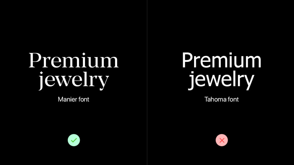
Since I believe that design is not only the style and colors – but a language – I think you need to pick the font types depending on what kind of message you want to convey. Also, you should take into consideration what’s the “voice” of your brand.
If you are a jewelry manufacturer, and you want to express luxury and high quality – you should definitely run with serif fonts such as Manier or Baskerville.
Contrary, if you are a Saas startup, using sans serif font such as SF Pro Display will be a great choice.
When picking the right font, always keep in mind that each of them represents certain emotions and qualities.
Also.. there is one amazing resource for premium fonts called Type Wolf by Jeremiah Shoaf. It’s a truly amazing resource and I use it every time for inspiration when I’m designing something. Definitely check it out!
3. Use high-quality images
Using your own photos is much better than using stock photos. I always recommend that to my clients.
The reason why is very simple.. your presentation will be way more authentic if you use your photos.
For example, if you are raising money, or pitching a business idea to investors, you definitely want to flash with photos of your team/office space.
When it comes to quality – make sure the photos are not blurred or in a low-quality. If this is a very important presentation, you might want to consider hiring a professional photographer.
4. Avoid special effects
The times when you were in school and teachers told you to use special effects are gone.
Using too many unnecessary effects (transitions, animations) might come off as annoying and unprofessional. They can easily distract the attention of your audience and that’s what you want to avoid.
And if you decide to use special effects, try to really limit them to a minimum.
5. Branding is your best friend
If you are representing your company, there is a big chance that you guys have a professionally designed logo and branding. In other words, you should have access to a brand style guide.
A brand style guide basically contains information on how to use the logo, what colors, what fonts, what shapes or patterns to use, and what qualities represent your brand.
All of that information is very important when it comes to designing PowerPoint presentations.
At the end when you look at your slides, all of them should be somewhat consistent with your branding.
6. Avoid text-heavy slides
There is nothing more boring than text-heavy slides. Avoid this at all cost!
The span of attention of people is very small. It’s getting harder and harder to keep the attention of your audience.
Let’s just have a look at these two sides.
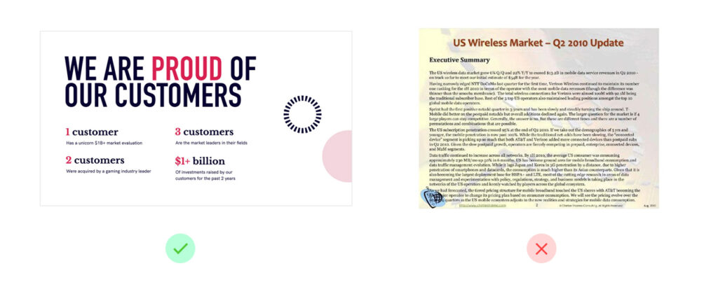
I guarantee to you, that 99% of people would skip reading the second slide. It’s just too much of a text.
In this scenario, a popular quote “less is sometimes more” applies.
A few rules to follow:
- Use less text
- Cut out information that can be said
- If you are lazy to reread your own slide – you are probably using too much text
Wrapping it up
So there you go.
Six easy design tips for PowerPoint presentations. They are all very basic and just by following them, you will significantly improve your design.
Just remember that you are always designing for your audience.
In case you don’t have much a time to deal with the presentation design, that’s what I do for a living. Feel free to reach out to me!