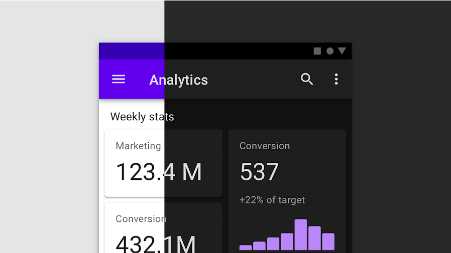
Are you struggling with dark mode design? You are in the right place. I written this article to provide actionable insights on how to incorporate dark mode seamlessly, ensuring your web design looks great and your website stays user-friendly.
Although dark mode design is gaining popularity, it’s not an essential feature for every website.
“As a freelance web designer that works with websites daily, dark mode feature is rare.”
But once you find yourself designing dark mode, you need to know what to do. And that’s what this guide is about.
What is dark mode design?
Dark mode design refers to a user interface (UI) design approach that primarily uses dark backgrounds, with light-colored text and elements.
This design basically reduces the amount of bright light emitted by screens, making it easier on the eyes in low-light environments and conserving battery life.
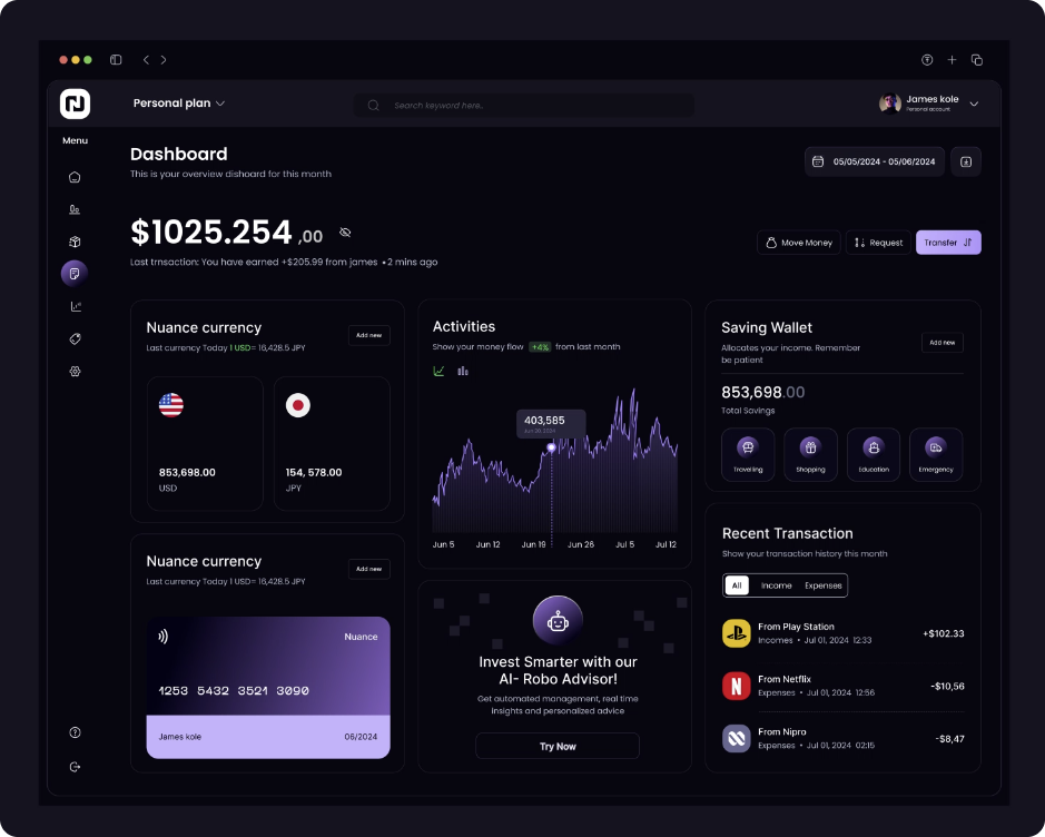
While popular for its aesthetic appeal, dark mode is often implemented as an optional feature. Users are often able to toggle between dark and light modes based on their preferences.
This is more common in mobile apps and iOS.
Interesting fact: Group of UX researchers at NNgroup conducted user survey and found out, that 1/3 of mobile users prefer light mode, 1/3 dark mode and 1/3 mix of both. Pretty interesting!
Key benefits of dark mode
Dark mode design is more than a trend; it provides tangible benefits for users and can enhance a website’s usability. Here are a few benefits reported by users:
- Reduces eye strain – Dark mode helps minimize the amount of bright light emitted by screens, making it easier on the eyes. It can be particularly beneficial for users who spend extended periods looking at screens. Keep in mind, however, that no scientific research has proven that dark mode design is essentially better for your eyes.
- Saves battery life – This claim comes from Google’s 2018 Android Dev Summit, where they demonstrated that dark mode can reduce power consumption.
- Enhances accessibility – Dark mode can improve accessibility for users with certain visual impairments, such as light sensitivity or cataracts. So if you want to improve the UX (user experience), your website should have dark mode feature.
As you can see, dark mode design has its place in the digital world. Whether you should design it for your website is a question of resources and usefulness.
Simply put, If you’re having 2,000 monthly visitors to your local plumbing business website, you probably don’t need to invest into dark mode design.
On the other hand, are you designing a dashboard, or some streaming service with 100,000 monthly visitors? Dark mode feature might be useful here.
Common problems when designing dark mode
You see.. I work as a web designer, and I’ve had my fair share of challenges when working with dark mode designs. While dark mode can be sleek and functional, it’s not as simple as inverting colors.
Here are some of the most common issues you can stumble on, and how to solve them:
1. Low contrast and readability issues
One of the most significant challenges in dark mode design is ensuring adequate contrast between text and background.
If the contrast is too low, readability suffers. On the other hand, excessive contrast (e.g., pure white text on a pure black background) can cause eye strain. You need to find a balance.
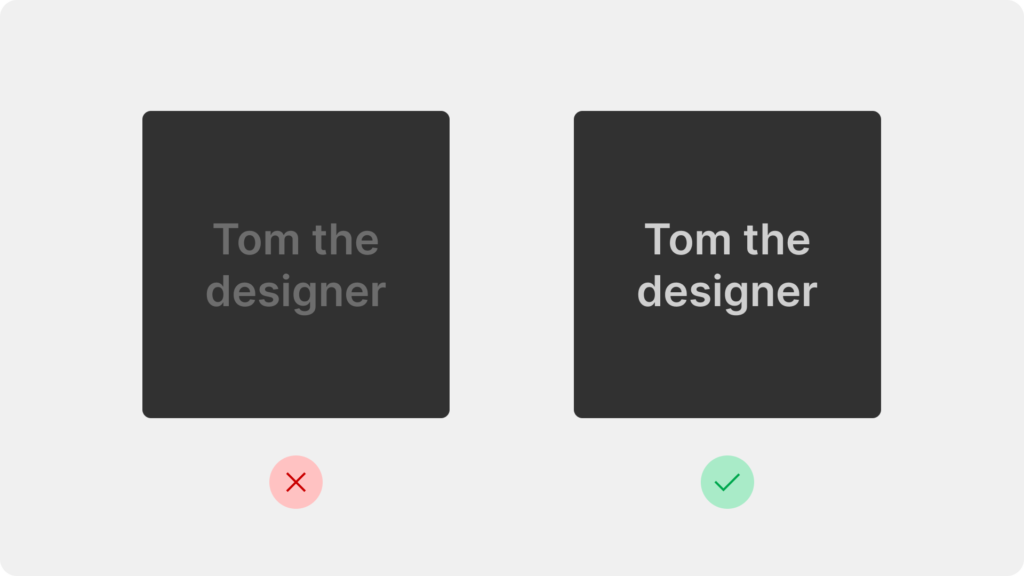
Solution: Use tools like WebAIM’s Contrast Checker to ensure compliance with WCAG guidelines. Aim for a contrast ratio of at least 4.5:1 for small text. Also try using dark gray backgrounds instead of pure black to soften the visual impact.
2. Maintaining brand colors and visual consistency
Dark mode can distort brand colors. Bright colors often look too intense on dark backgrounds, while muted shades may appear washed out.
Solution: Adjust brand colors specifically for dark mode. For example, slightly desaturate vibrant hues to prevent them from overpowering the design. This ensures your brand remains recognizable without overwhelming the user.
3. Designing shadows and depth
Elements like shadows, which create depth in light mode, are less effective on dark backgrounds.
Shadows can either disappear entirely or become unnaturally prominent.
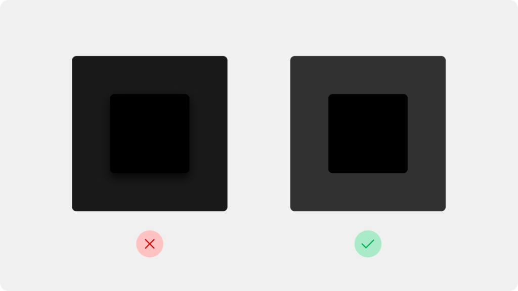
Solution: Use subtle glows or lighter shades of the background color instead of traditional shadows to create depth and maintain the design’s aesthetic. From my experience, your best bet is to adjust the background colors and making sure your color palette is on point.
4. Overlooking dynamic content
Dynamic elements like images, charts, or embedded videos will not automatically adapt to dark mode.
The problem is, that a bright image can clash with an otherwise dark interface, ruining the visual harmony and giving users eye strain.
Of course – you can never optimize all content for big websites (think of Netflix), but if you are working for a 5-pager website, it’s easier.
Solution: Plan for alternate versions of images or graphics optimized for dark mode. For example, when developing website knowing there will be dark mode, ask designer to prepare content for dark mode as well.
Actionable tips for designing dark mode
Now we are getting to the sweet stuff. Actionable tips that will improve your dark mode designs immediately!
Let’s dive right into it.
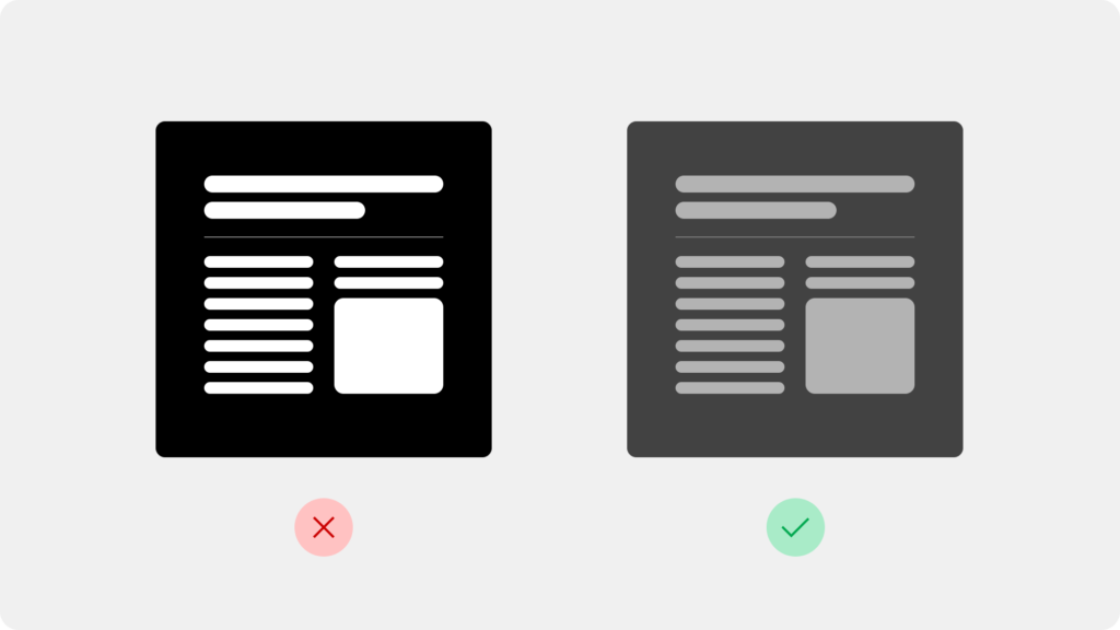
1. Use dark grays instead of pure black
Pure black backgrounds can be harsh and increase eye strain, especially on high-contrast screens.
Instead, use dark gray tones to create a softer and more comfortable experience. This is very easy fix that will immediately improve your dark mode designs.
You can see a real-life example directly on my homepage. I use dark grey everywhere where you would normally use black.
Interesting fact: Most popular apps like Instagram and Twitter use dark gray backgrounds instead of pure black for their dark mode, as it’s easier on the eyes. There’s no need to reinvent the wheel – just do what already works!
2. Optimize typography for readability
Dark mode can make your texts harder to read if you don’t handle this correctly. Focus on text size, weight, and contrast to ensure users can easily read content without strain.
Also, sometimes it’s good to avoid pure white text (#FFFFFF). Instead, use off-white shades like #E0E0E0 for body text and slightly bolder shades for headings.
If you don’t know how to choose a font, I written also an article featuring top 32 best fonts for your website. I’m sure that article will help you out.
Research shows that reading white text on a dark background can cause halation, where the text seems to glow, reducing readability. Off-white tones minimize this effect.
3. Allow Users to Switch Easily
Very easy, but effective way to improve your dark mode design is to include a switch that is easy to on your website.
Users appreciate having control over their experience.
All people are different, and not everybody likes dark mode design. Let people choose what mode they want to be using.
Actionable Tip: Save the user’s preference using cookies or local storage so they don’t have to reset their choice every time they visit your site.
4. Test on Multiple Devices and Screens
Dark mode can appear differently across devices due to variations in display technology and settings.
There are all types of monitors that display colors a bit differently.
From my personal experience.. I was once testing a dark mode feature for a startup’s dashboard. After a few minutes I noticed immediately the design looked fantastic on an iPhone with OLED but appeared washed out on a standard laptop screen. Adjusting the contrast resolved the issue.
Actionable Tip: Test your design on all kinds of screens that you can. Be it mobile, android, iOS, tablet laptop or even computer monitor. Ensure the dark mode is consistent and legible across all platforms.
Wrapping it up
In this article I provided you some actionable tips for designing dark mode. Now it’s your turn to go out there and learn by doing. That’s the best way to learn how to design for dark mode.
We also talked about some common challenges, and how to overcome them with actionable tips. Below are the key takeaways:
- Dark mode offers benefits like reducing eye strain, saving battery life, and improving accessibility.
- Successful dark mode design requires careful attention to contrast, brand colors, and content adaptation.
- Always test your dark mode designs across devices and provide users with an easy toggle option for their preference.
Remember, dark mode isn’t necessary for every website.
Evaluate your audience’s needs, and when you do implement it, aim for balance and usability. Keep experimenting, testing, and refining—because the best designs always put the user first.
Now it’s time to apply these insights to your next project. Happy designing!
